

- Latch Infinity
- Video Production
Shooting for Nine Aspect Ratios: How to Plan One Shoot for Every Platform
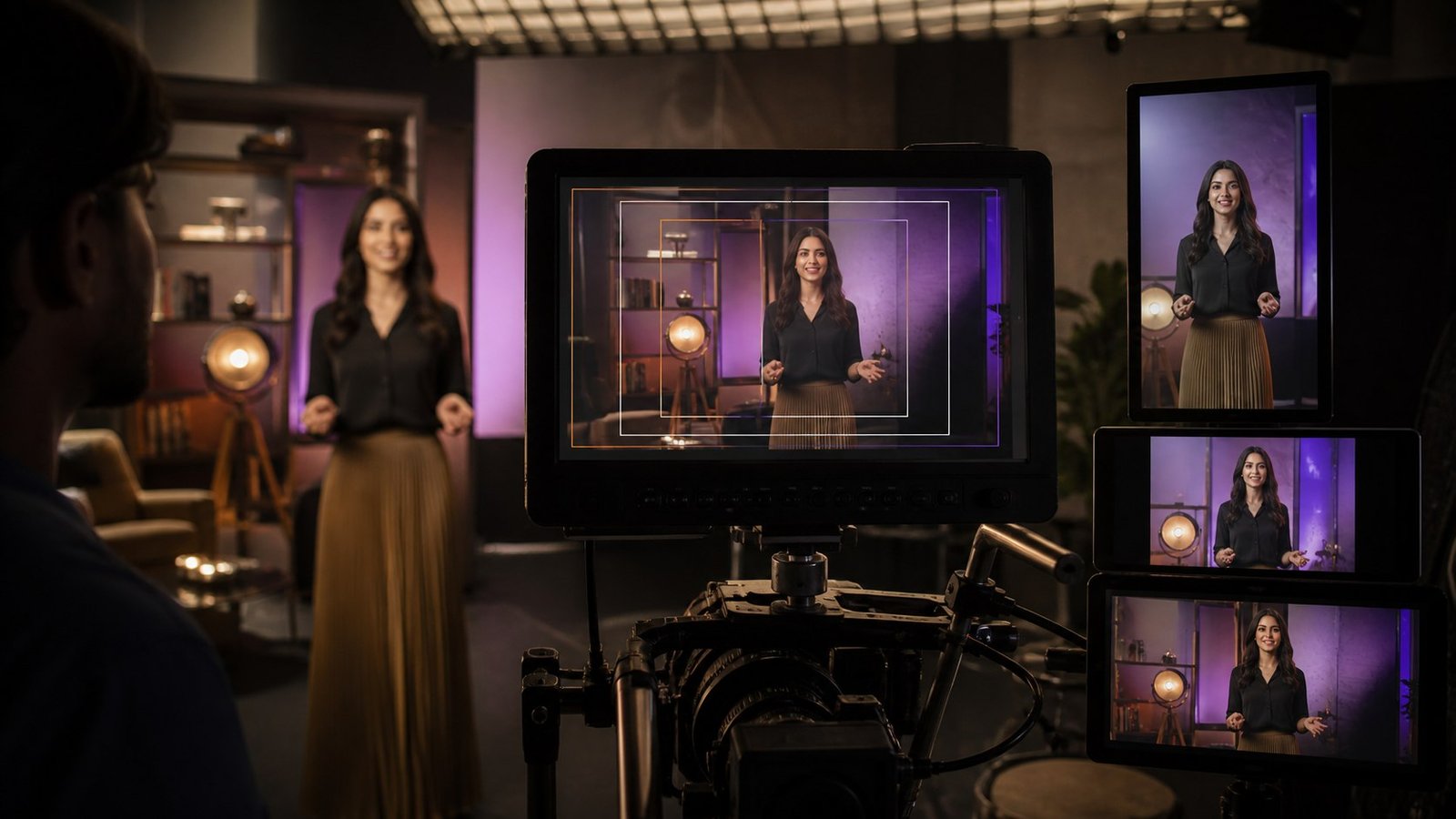
The brief said “one video.”
The delivery folder wants a 16:9 for YouTube. A 9:16 for Reels, Shorts and TikTok. A 4:5 for the Instagram feed. A 1:1 because someone’s legacy placement still needs it. A 2:1 for LinkedIn. Plus 6-second, 15-second and 30-second cutdowns of most of those, in most of those ratios.
That is not one video. That is a spreadsheet wearing a video’s coat.
Handled badly, this matrix is where video budgets go to die - usually in a panicked post- production session where a gorgeously composed landscape frame gets cropped into a vertical one, severing the subject’s head and all of the type. Handled well, it costs almost nothing extra, because every decision that makes it work happens before the shoot, not after.
Vertical stopped asking permission
The pressure isn’t evenly spread. 9:16 at 1080 × 1920 is now the default for Reels, Shorts and TikTok, and vertical accounts for the overwhelming majority of mobile video consumption. Reported engagement advantages over horizontal on mobile feeds are big - commonly cited around 90% higher - and the reason is embarrassingly simple.
A 9:16 video fills the entire screen. A 16:9 video in a vertical feed occupies about a fifth of it and politely asks the viewer to rotate their phone. Nobody rotates their phone. Nobody has rotated a phone since 2019.
Meanwhile, 16:9 is still absolutely correct for YouTube long-form, websites, and anything destined for a television or a projector. So the answer was never “shoot vertical.” It’s “shoot so both are native, and neither feels like a hostage.”
The founding principle: shoot wider than you frame
The technique underneath everything else is capturing more resolution than you deliver. Shoot in 4K (3840 × 2160), deliver in 1080p, and you’re sitting on a 2× surplus. That surplus is what lets you pull a full-resolution 1080 × 1920 vertical crop straight out of a horizontal frame - and reposition within the shot in post without the image quietly falling apart.
Two consequences, both of which need agreeing before the shoot, not during it:
Shoot 4K minimum, 6K on hero setups. The extra storage costs less than a sandwich. A reshoot does not. On shots where you know a dramatic vertical crop is coming, 6K or open- gate capture buys you genuine freedom.
Frame for the crop, not the monitor. The operator is composing a 16:9 frame, but the composition that actually matters is the 9:16 rectangle living inside it. This is a real discipline shift, and it’s the single biggest predictor of whether your vertical cut looks intentional or rescued.
Safe zones: the constraint you can’t see
Every platform cheerfully stacks its own furniture on top of your video. Captions. Usernames. The like-share-comment column. The CTA button. The progress bar.
Put your subject or your text underneath any of it and the viewer gets a beautifully lit elbow behind a “Follow” button. Nobody wins.
For 9:16, the working rule is to keep everything essential - faces, product, on-screen type - in the central band, leaving roughly 250 pixels clear at the top and 400 to 450 clear at the bottom of a 1920-pixel-tall frame. Platforms encroach differently, so build to the greediest one and you’re covered everywhere.
The practical move: load a safe-zone overlay onto the camera monitor. Most modern monitors support custom frame guides. The director and the client watching video village should be looking at the vertical rectangle with the danger bands shaded, not the raw sensor image. One piece of kit, most cropping disasters prevented. Worth the cable.
Framing habits that survive the crop (and ones that don’t)
Centre your subject vertically. A subject on a horizontal third looks elegant in 16:9 and falls straight off the edge in 9:16. If a shot has to serve both, centre it. Want the third-based composition? Fine - shoot it as a dedicated horizontal-only setup and stop pretending.
Shoot tighter than instinct suggests. Wide establishers are the worst offenders. Crop a wide to 9:16 and you get a sliver of context with a subject the size of a raisin. Plan dedicated vertical establishers instead: a low angle up a building, a corridor receding, anything that’s tall. Verticality is a genuine creative constraint, and vertical-native composition is a different craft - not a lesser one.
Keep negative space above and below. In horizontal, headroom is a cost. In vertical, it’s what keeps your subject clear of the caption band.
Don’t bake horizontal text into the shot. Slates, signs, wall graphics - all of it crops. Add text in post, per ratio, like a person who has learned from experience.
Mind your movement axis. A left-to-right dolly reads beautifully in 16:9 and will happily walk your subject out of a vertical frame mid-shot. Vertical prefers push-ins, tilts, and static frames with movement happening inside them.
Coverage: the 20% that saves everything
Don’t try to make every shot serve every ratio. That way lies compromise and mild despair. Instead, accept that a handful of shots need dedicated versions.
For every hero moment, capture one horizontal setup and one vertical-native setup. This typically adds 15 to 20% to the shooting schedule - not 100% - because the lights, the talent, the location and the crew are already standing right there, drinking chai.
Put the supplement in the schedule explicitly. The failure mode is calling it “we’ll grab it if there’s time.” There is never time. There has never once been time.
Post: build one master, derive the rest
Structure the edit so ratios are derivatives, not separate projects with separate opinions.
Cut the 16:9 master first - it’s usually the longest and most complete version, and it enforces narrative discipline. Then duplicate the sequence and reframe shot by shot for vertical. Auto-reframe tools have genuinely improved and make a decent first pass, but they track motion, not meaning. In a two-shot, they will follow the wrong face with total confidence, every single time.
Rebuild graphics per ratio. Never scale them. A lower third designed for 16:9 becomes an eye test in 9:16. Design a small system with a horizontal and a vertical variant of each element and the rebuild takes minutes instead of afternoons.
Export everything from one colour-graded master. Nothing torpedoes a campaign faster than the vertical cut arriving half a stop darker than the horizontal one, and nobody noticing until the client does.
The deliverables checklist
Agree this at the brief stage. Not the delivery stage. The brief stage.
• 16:9 (1920 × 1080) - YouTube, website, events • 9:16 (1080 × 1920) - Reels, Shorts, TikTok, Stories • 4:5 (1080 × 1350) - Instagram and Facebook feed • 1:1 (1080 × 1080) - legacy feed placements • Cutdowns: 6s, 15s, 30s and full length, per ratio as required • Captioned and uncaptioned versions of each • A subtitle file (.srt) per language
Write it into the scope. Every ratio that appears after the shoot costs roughly ten times what it would have cost before it, and about forty times the goodwill.
The tenth ratio nobody counts: sound off
There’s one more format constraint hiding inside all the others, and it doesn’t appear in any specification sheet.
A very large share of feed video is watched with the sound muted - on a commute, in an office, in bed at 1am next to a sleeping person. Which means your beautifully mixed voiceover is, for a substantial portion of the audience, not happening at all.
The implications are structural, not cosmetic:
Captions are content, not accessibility compliance. Burn them in for social cuts rather than relying on platform auto-captions, which are inconsistent, unbranded and frequently wrong about proper nouns. Style them as part of the design system - position, weight, colour, the way they animate.
The first three seconds must work silently. If your hook is a spoken line, half your audience never receives it. Put the hook on screen as well, or build it visually.
Design for the caption band. This is the practical link back to safe zones - captions occupy real estate at the bottom of the frame, which is precisely where inexperienced editors like to put lower thirds.
Then mix properly anyway. The audience that does turn sound on is your most engaged segment, and they notice when the audio is thin. Sound-off design is an addition, not a replacement.
Treat “sound off” as an eleventh deliverable in the matrix and you’ll stop losing the half of the audience that never heard a word.